 color palettes
Bold · 3 original colors
Edit in the studio ↗Tangerine print
A graphic three-color poster in orange, blue and straw.
Save this palette as an image
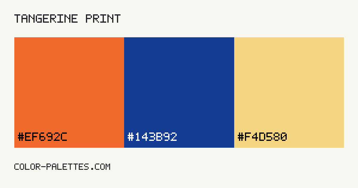 Download palette PNG
A website adaptation.
The original swatches above stay unchanged in the palette generator. This preview adapts them into readable website roles.
studio / notesA color study
An idea worth exploringSmall details.
Small details.
Whole new perspective.
The right colors give everyday ideas a little more character. Start with a clear canvas and make room for what matters.
Read the field notes01 / A fresh start
Let the details do the talking.
A supporting surface, a useful accent, and text you can actually read.
A note on contrast →Thoughtful colors, considered roles.Explore / Create / Refine
Live HTML preview. Button and accent labels use a derived black or white foreground.
The contrast check
| Pair | Foreground / background | Ratio | Text result |
|---|---|---|---|
| Body text | #251A16 / #FEF9F7 | 16.24:1 | AAA text |
| Card text | #251A16 / #F6ECE9 | 14.61:1 | AAA text |
| Primary as a text link | #BC4600 / #FEF9F7 | 5.01:1 | AA text |
| Button label | #FFFFFF / #BC4600 | 5.23:1 | AA text |
| Accent label | #000000 / #51D6FF | 12.41:1 | AAA text |
AA normal: 4.5:1. AA large: 3:1. AAA normal: 7:1. Results use unrounded values. These checks do not certify a whole design. Read the methodology.
Take it with you
Your palette, in CSS.
Names describe the role, so your stylesheet stays useful when your colors change.
:root {
  --color-background: #fef9f7;
  --color-surface: #f6ece9;
  --color-text: #251a16;
  --color-primary: #bc4600;
  --color-accent: #51d6ff;
  --color-on-primary: #ffffff;
  --color-on-accent: #000000;
}